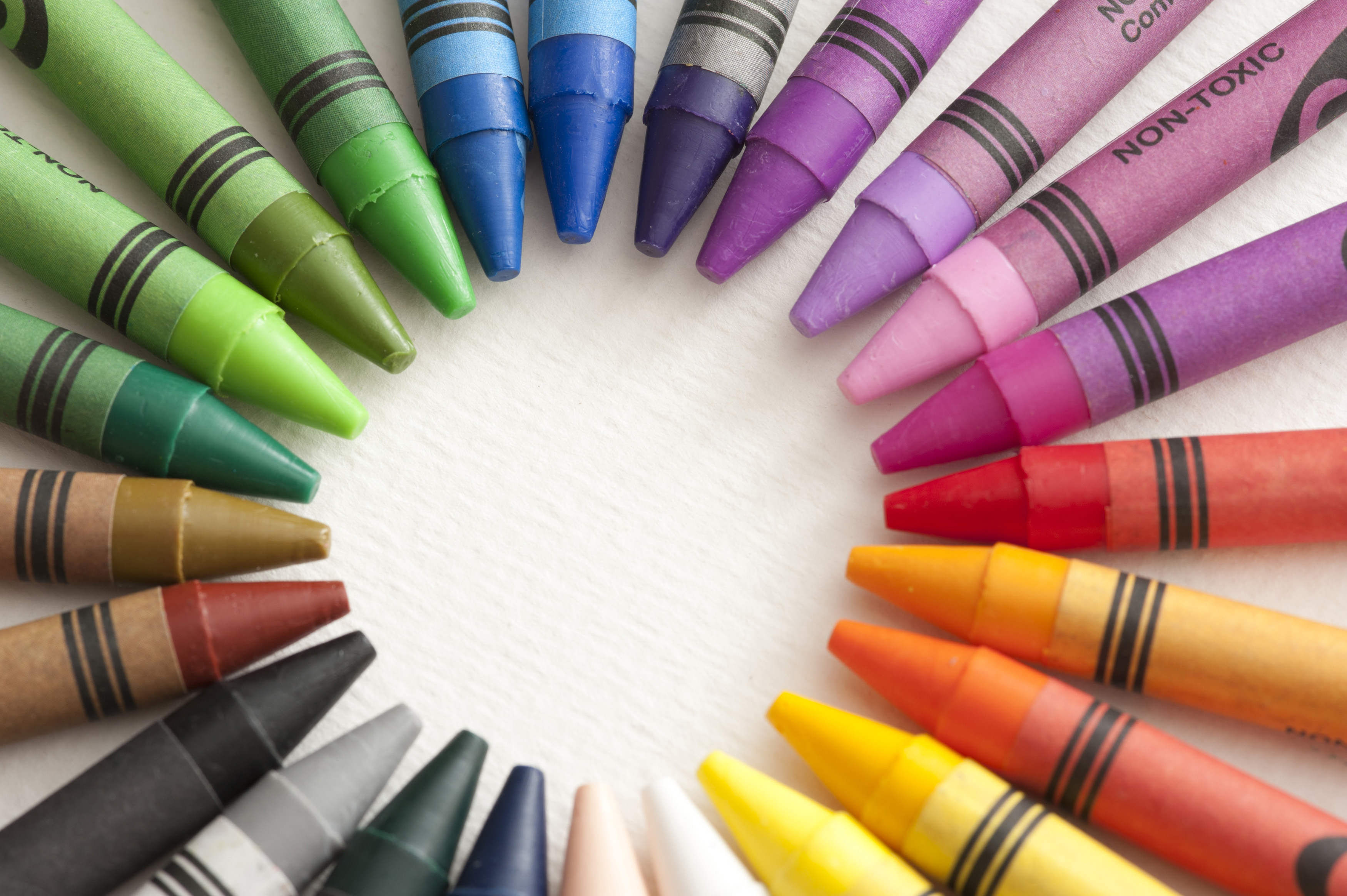
Image by freeimageslive.co.uk – gratuit
Seeing red…. green with jealousy….. feeling blue. Associating colours with emotions is not new, but increasingly, psychologists are being asked to explore the relationship between colour, emotion and its impact in a number of different settings, including learning in classroom settings, the design of the built environment, including work spaces and travel hubs, and improving wellbeing as a result.
Colour is a powerful tool. It can be used to get attention, enhance clarity, establish a code, label and differentiate items, as well as to influence behaviour or learning outcomes. For example in schools we are often told to use blue or black ink. Red ink is supposed to be used by teachers to correct assignments, notebooks, and class work. This is a deliberate tool to draw our attention to the mistake we make, designed to help enhance our learning outcomes, in the sense that by drawing attention to the mistake we will remember not to repeat the points highlighted.
“Bad” and “good” colours
Studies have disagreed on how exactly our association between colour and emotions develops. Some have suggested it is an instinctive reaction, something primal which suggests to us that things that are red in colour are dangerous or negative, while blues and yellows signal happier less aggressive colours.
However, others have suggested that the connotations we associate with colour are learned, albeit from a very young age. We associate some colours as being “good” and others as “bad” and this impacts how we interact around them in spaces like classrooms and workspaces. The meaning of colours is culturally-specific and differs around the world in different societies and groups.
However, a third view is that colour theory is much more complex than simply yellow = happy and blue = sad. Colours can have several meanings, and can encourage an audience to feel or act in certain ways depending on when and how they are used, and in some instances depending on personal experiences which people link to specific colours. This is the reason why the literature on colour is so contested; in many instances it blurs the boundary between our instinctive associations of colours and those associations we create ourselves through experiences.

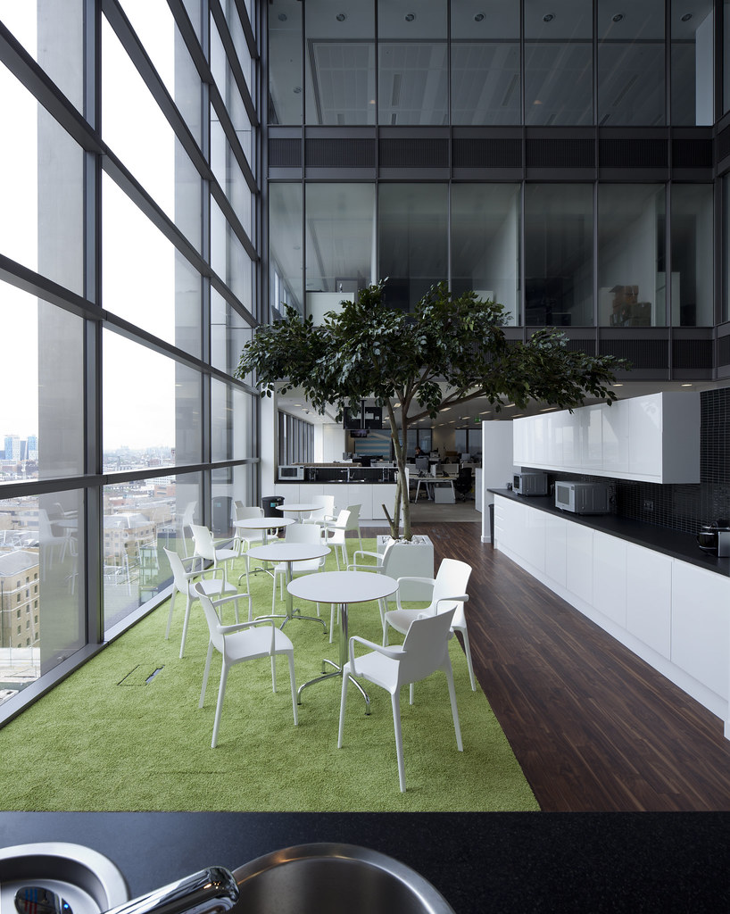
Image “Harvey_Nash_13″ by K2 Space is licensed under CC BY 2.0
How colours are impacting on the design of our spaces
Knowing how colour can affect behaviours is informative for designers and psychologists in a number of environments, including in schools, offices or hospitals. In a learning context, such as in a school using “engaging” hues (warm colours such as red, orange, and yellow) to prevent learners from getting bored, and passive hues (cold colours such as green and blue) to keep learners calm can help with learning, but getting this balance right is important.
A number of studies have looked at the impact of classroom design, including use of colour on the learning and behavioural outcomes of both neurodiverse, and neurotypical children, with many emphasising that overstimulation, particularly of young children through excessive use of bright colour can create a disruptive classroom environment and make it difficult to encourage concentration and staying on task. However, some colour in specific areas of the classroom is good to help with engagement and stimulation.
Similarly, colours have been used by architects and designers in their choice of building material or building design to help encourage feelings of calm or reflection. This is particularly the case in transport hubs like airports and in hospitals or care facilities. Using fresh and calming colours which relate strongly to nature is also a technique used by office designers to help create the feeling of open calm and fresh spaces to help improve working environments and improve productivity.
The design of the built environment and how “green” and “blue” features which incorporate natural materials (green spaces and water have a positive impact on mental and physical wellbeing) has been widely discussed by planners and architects. The evidence generally supports the view that the inclusion of green spaces, promotes health and wellbeing across the life course. This combination of colour and the integration of nature into spaces is being used increasingly in the design of buildings and in master planning for large urban projects.
Final thoughts
Colour and emotion both play important roles in our capacity to learn and be productive. The association between colour and our emotions and actions is complex and a source of disagreement for some psychologists. Colour has been found to affect how people feel both psychologically and physically. Understanding how colour and emotion relate – and how colour can be used to change environments to encourage particular feelings of calmness or concentration, particularly in schools and workplaces – is something that will be further explored by designers.
Colour should be understood as part of a wider “toolkit” used by designers and architects to ensure that we are building better places that create environments which support and promote wellbeing, encourage positive emotions and create more effective spaces for us to work, learn and interact in.
Follow us on Twitter to see which topics are interesting our research team
A message to all subscribers to
The Knowledge Exchange information service
We are open for business and continue to provide current awareness and enquiries services to our clients. If you have any questions, please get in touch.
Share
Related Posts
A recent item on BBC Radio 4’s Today programme generated an unusually high number of responses from listeners. A man who had lost his job in the financial services sector at the age of 57 described his difficulty in trying ....
By Donna Gardiner While free school meals (FSM) have been available in England on a means-tested basis since 1944, recent years have seen a renewed focus upon the potential benefits of providing free school meals to all school-aged children. Currently, ....
By Ian Babelon A new-old concept for proximity “Are we there yet?” Parents may patiently nod to their children’s insistent nudges on a 20-minute journey to… somewhere. Quite rightly, researchers have asked: twenty minutes to what? The answer may well ....

